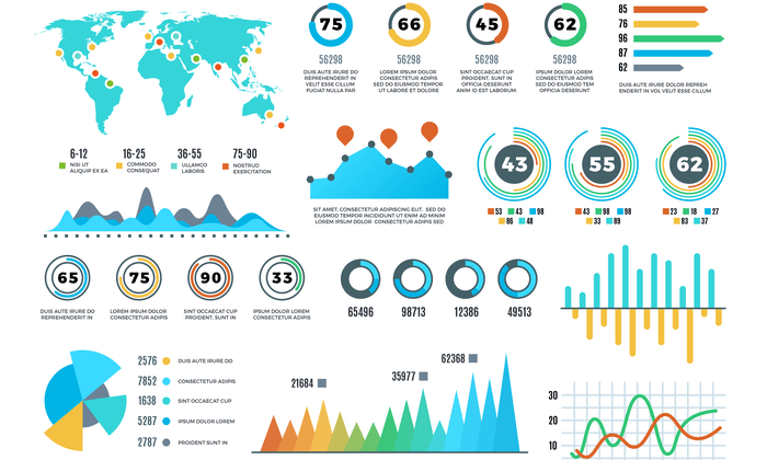
Using Data Visualization in Content kicks off a visual journey into the world of enhancing engagement and simplifying complex information through captivating visuals. From charts to infographics, get ready to dive into the power of data visualization.
Benefits of Data Visualization in Content: Using Data Visualization In Content
Data visualization plays a crucial role in enhancing content engagement by transforming complex data into easily digestible visual representations. This not only captivates the audience’s attention but also enables them to grasp information more effectively.
Enhanced Understanding
- Data visualization simplifies complex information by presenting it in a visually appealing format, such as charts, graphs, or infographics.
- For example, a pie chart can quickly convey the distribution of sales across different regions, making it easier for viewers to understand the data at a glance.
Improved Memorability
- Visual elements are more memorable than plain text, making data visualization a powerful tool in making content stick in the audience’s mind.
- By incorporating visually appealing elements like color coding or interactive charts, content creators can enhance the memorability of key information.
Types of Data Visualization Techniques

Data visualization techniques play a crucial role in making complex data more understandable and actionable. Let’s explore different types of data visualization techniques such as charts, graphs, maps, and infographics and their effectiveness in conveying information.
Charts
Charts are graphical representations of data that help in visualizing trends, comparisons, and relationships. Bar charts are useful for comparing different categories, line charts for showing trends over time, and pie charts for illustrating proportions.
Graphs
Graphs are effective in displaying connections and relationships between data points. For instance, scatter plots are useful for showing correlations between variables, while histograms help in understanding the distribution of data.
Maps
Maps are great for visualizing spatial data and geographical patterns. They can be used to represent data points geographically, making it easier to identify regional trends and disparities.
Infographics
Infographics combine visuals, text, and data to tell a compelling story. They are ideal for presenting complex information in a visually appealing and easy-to-understand format, making them perfect for content marketing and educational purposes.
Tools for Creating Data Visualizations
Data visualization tools play a crucial role in transforming raw data into meaningful insights that can be easily understood. Let’s explore some popular tools used for creating data visualizations and their unique features and benefits.
Tableau
- Tableau is a powerful data visualization tool known for its user-friendly interface and robust functionality.
- It offers a wide range of visualization options, from simple charts to interactive dashboards, allowing users to create visually appealing representations of data.
- Tableau also provides advanced analytics capabilities, enabling users to perform complex data analysis and gain deeper insights.
Power BI
- Power BI is another popular data visualization tool developed by Microsoft, designed for seamless integration with other Microsoft products.
- It offers a variety of visualization options and customizable dashboards, making it easy to create dynamic and interactive reports.
- Power BI also provides robust data modeling capabilities, allowing users to manipulate and analyze data from multiple sources.
Google Data Studio
- Google Data Studio is a free tool that enables users to create interactive dashboards and reports using data from various sources, such as Google Analytics, Google Sheets, and more.
- It offers a user-friendly drag-and-drop interface, making it easy for users to build custom visualizations without the need for coding.
- Google Data Studio also allows for easy collaboration and sharing of reports, making it ideal for teams working on data analysis projects.
Best Practices for Using Data Visualization in Content

When it comes to incorporating data visualizations into your content, there are some best practices to keep in mind to ensure that your visuals are effective and engaging for your audience.
Selecting the Right Color Schemes and Fonts
When creating data visualizations, it’s essential to choose color schemes and fonts that not only look visually appealing but also enhance the readability and understanding of the data. Here are some tips to consider:
- Use a limited color palette to avoid overwhelming the audience.
- Ensure that the colors you choose are accessible to all individuals, including those with color vision deficiencies.
- Use high contrast colors to differentiate between data points effectively.
- Choose clean and easy-to-read fonts that are legible, especially when displaying small text.
Maintaining Consistency in Data Visualization Styles
Consistency is key when it comes to creating data visualizations that are easy to understand and interpret. By maintaining consistency in your visual styles, you can help your audience navigate through the information seamlessly. Here are some guidelines to follow:
- Stick to a consistent color scheme and font style throughout your visualizations.
- Use the same types of charts or graphs when presenting similar types of data for better comparison.
- Ensure that your visualizations have a consistent layout and design for a cohesive look.
Creating Accessible Data Visualizations, Using Data Visualization in Content
Accessibility is crucial when it comes to making your data visualizations inclusive for all audiences. Here are some tips to ensure that your visualizations are accessible to everyone:
- Provide alternative text descriptions for images and graphs to assist visually impaired individuals using screen readers.
- Use descriptive titles and labels to make your visualizations understandable without relying solely on color.
- Consider the use of interactive features or audio descriptions to cater to a diverse audience.
