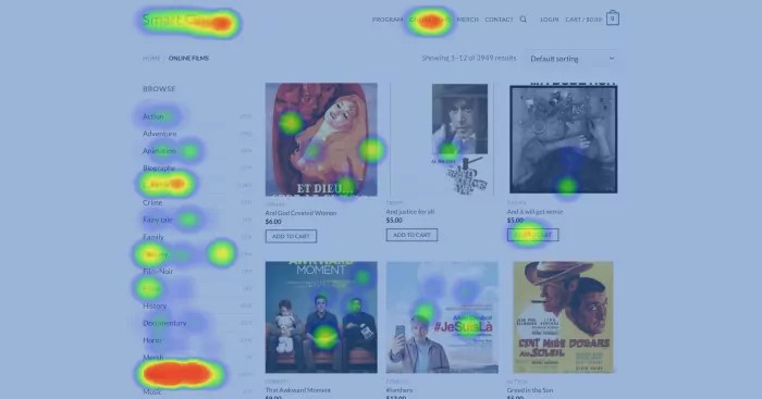
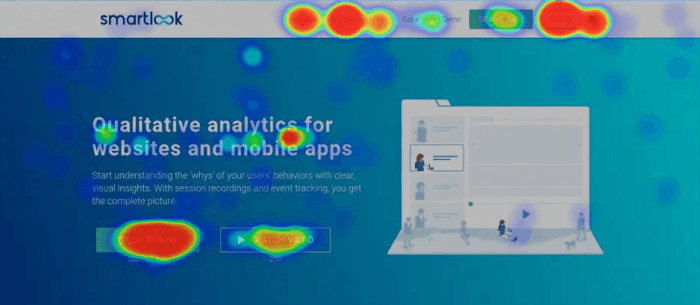
Understanding Website Heatmaps dives into the world of web analytics, exploring the different types of heatmaps and their significance in deciphering user behavior patterns. Get ready to uncover the secrets behind user engagement!
Introduction to Website Heatmaps
Website heatmaps are visual tools used in web analytics to track and analyze user behavior on a website. By displaying data in a graphical format, website heatmaps provide valuable insights into how users interact with a site, helping businesses make informed decisions to improve user experience and conversion rates.
Types of Website Heatmaps
- Click Maps: Show where users are clicking on a webpage, highlighting popular areas and elements.
- Scroll Maps: Display how far down a page users are scrolling before leaving, indicating content visibility.
- Move Maps: Track cursor movements, showcasing user attention and interest areas.
Website heatmaps are crucial in understanding user behavior patterns, preferences, and pain points on a website. By analyzing these visual representations, businesses can optimize their web design, content placement, and overall user journey to enhance engagement and drive conversions.
Benefits of Using Website Heatmaps

Website heatmaps offer a variety of advantages for optimizing user experience. By visually representing user behavior on a webpage, heatmaps can provide valuable insights into how visitors interact with different elements on the site.
Identifying Popular Areas on a Webpage, Understanding Website Heatmaps
Using website heatmaps, businesses can easily identify which areas of a webpage attract the most attention from users. Heatmaps visually represent this data, showing hot spots where users spend the most time or click the most. This information can help businesses prioritize content, buttons, or links in these popular areas to enhance user engagement and drive conversions.
Insights into User Engagement and Interaction
Website heatmaps can also provide insights into user engagement and interaction with specific website elements. By analyzing scroll maps, businesses can see how far users scroll down a page before losing interest. Additionally, click maps can show which elements users interact with the most, helping businesses understand what content or features are most engaging to their audience. This data can be used to optimize website design, improve user experience, and ultimately drive better results.
Understanding Click Maps: Understanding Website Heatmaps
Click maps are visual representations that show where users are clicking on a webpage. They provide valuable insights into user behavior and help website owners understand which areas of their site are being interacted with the most.
By analyzing click maps, businesses can identify high-performing areas where users are most engaged and low-performing areas that may need improvement. This data can be used to optimize website design, layout, and content to enhance user experience and drive conversions.
Identifying High and Low Performing Areas
- High-performing areas: These are sections of the website where users are clicking the most. By analyzing these areas, businesses can understand what content or features are most popular among visitors.
- Low-performing areas: These are sections of the website where users are clicking less or not at all. By identifying these areas, businesses can make necessary changes to improve user engagement and interaction.
Analyzing Click Maps for Improvement
- Focus on hotspots: Look for areas on the click map with high click density, indicating popular sections. These areas can be optimized further to enhance user experience.
- Track user flow: Analyze the sequence of clicks to understand how users navigate through the website. This insight can help in improving the layout and structure of the site for better user flow.
- Testing and iteration: Use click maps to test different design elements or content placement and track how they impact user interaction. Continuously iterate based on the data to enhance website performance.
Interpreting Scroll Maps
Scroll maps are visual representations of how far down a webpage users scroll before leaving. They provide valuable insights into user behavior and engagement.
Optimizing Content Placement and Length
Scroll maps can be used to optimize content placement by showing which parts of a webpage are most viewed and which are often ignored. By analyzing scroll maps, businesses can adjust the placement of important content to ensure it is seen by more users.
Moreover, scroll maps can help in optimizing content length by indicating where users tend to stop scrolling. This information can guide businesses in creating more concise and engaging content that keeps users on the page longer.
Tips for Interpreting Scroll Maps
- Focus on the red areas: The reddest areas on a scroll map indicate the most viewed sections of a webpage. Pay attention to these areas to understand what content is capturing users’ attention.
- Identify drop-off points: Look for abrupt changes in color on the scroll map, as these indicate where users are leaving the page. Analyze these drop-off points to determine potential issues with content or user experience.
- Compare with other metrics: Combine scroll map data with other website analytics, such as bounce rates and time on page, to get a comprehensive view of user behavior. This integrated approach can reveal patterns and insights that may not be obvious from scroll maps alone.
- Experiment and iterate: Use scroll map insights to make informed changes to your website, then monitor the impact on user behavior. Continuously iterate and test different content placements and lengths based on scroll map data to optimize user engagement and reduce bounce rates.
Analyzing Move Maps

Move maps play a crucial role in tracking mouse movements and gestures on a webpage, providing valuable insights into user behavior and interaction patterns. By analyzing move maps, website owners can better understand user attention and interest in specific elements, leading to informed decisions for optimizing the user experience.
Revealing User Attention
Move maps can reveal how users navigate through a webpage, showing which elements they hover over, click on, or interact with the most. This data helps identify popular areas of the page and indicates where users are focusing their attention. By analyzing move maps, website owners can gain a deeper understanding of user behavior and preferences, allowing them to tailor the layout and content to better meet user expectations.
- Identify hotspots: Look for areas on the move map where there is a high concentration of mouse movements. These hotspots indicate elements that attract significant user attention.
- Track mouse paths: Analyze the paths that users take as they move their mouse across the page. This information can help identify common navigation patterns and areas of interest.
- Monitor dwell time: Pay attention to how long users spend hovering over specific elements. Longer dwell times may indicate user interest or confusion, prompting further investigation.
Improving Call-to-Action Placements
Analyzing move maps can provide valuable insights for optimizing call-to-action (CTA) placements on a webpage. By understanding where users are most active and engaged, website owners can strategically position CTAs to maximize visibility and effectiveness.
- Place CTAs in high-traffic areas: Use move map data to identify areas with the most mouse movements and interactions, and strategically place CTAs in these prominent locations.
- Test different placements: Experiment with various CTA placements based on move map analysis to determine the most effective positioning for driving user engagement and conversions.
- Optimize for user behavior: Tailor CTA placements to align with common user navigation patterns and interactions revealed by move maps, ensuring a seamless and intuitive user experience.
